

Konvex former Wihom Software
EASIER BANK RECONCILIATION WITH WIHOM
Fintech / B2B / Startup / Banking
OVERVIEW
An innovative tool to manage store payments and monitor bank statements.
Team: Head of Product, Head of Development, UI/UX Lead
My role: UX Researcher and Designer Intern
Time: 6 Months
Tools: Adobe XD, Adobe Suite, Micosoft Clarity, Hubspot, Google Analytics and other.
ROADMAP
-
Open banking enables secure access for third-party apps to your banking details, enhancing financial services and creating innovative tools while providing greater control over your data. Its primary aim is to enhance financial services by granting easier access to banking data for third-party providers, fostering innovation, boosting competition, and offering consumers more control over their financial information.
-
The product had gone through multiple iterations, but there was a lack of concrete data to rely on. Consequently, my subsequent actions involved understanding both the users and the market. I conducted several rounds of user interviews, successfully creating three user personas to inform our work. Concurrently, I conducted thorough competitor research and developed information architectures and wireframes for swift iteration. Leveraging these personas, I formulated a content strategy for the blog with the goal of enhancing our organic growth.
-
I utilized applications such as HubSpot, SEMrush, Google Analytics, Microsoft Clarity, Google Trends, WhatsApp, and developed user interviews to gather, analyze, and suggest various solutions aimed at enhancing our users' experience and simplifying the funnel process to gain conversions.
We implemented a strategy of rapid iteration, learning from our errors, and actively involving ourselves with user feedback to consistently enhance our approach. Each week, we aimed to revamp different facets, adapting our perspectives accordingly.
Additionally, we established a newsletter to maintain direct communication with our users and successfully launched Wihom's web application on the Shopify store.
RESEARCH
Background
In Colombia, there's limited awareness about an app capable of managing store payments and monitoring bank statements, primarily because the country is in the early stages of adopting and regulating this technology.


I created user personas using information collected from interviews. I found an innovative approach to conducting informal interviews by requesting audio responses through WhatsApp. This method was essential due to our tight budget and proved incredibly helpful, as I could share the findings with the team by storing these audio files in a shared folder.
Excel served as an excellent tool for tracking the outcomes of extensive research. It enabled me to score each stage of the project, monitor the process, and easily share the information with others.
In this instance, a Heuristic Evaluation was conducted for the landing page.
DESIGN
Web application
Part of our requirements were to make the user feel welcomed and secure, for this we had to discover the optimal way to link various services and passcodes without burdening users. After numerous iterations, we crafted a four-step onboarding process with minimal clicks.
Company website and blog
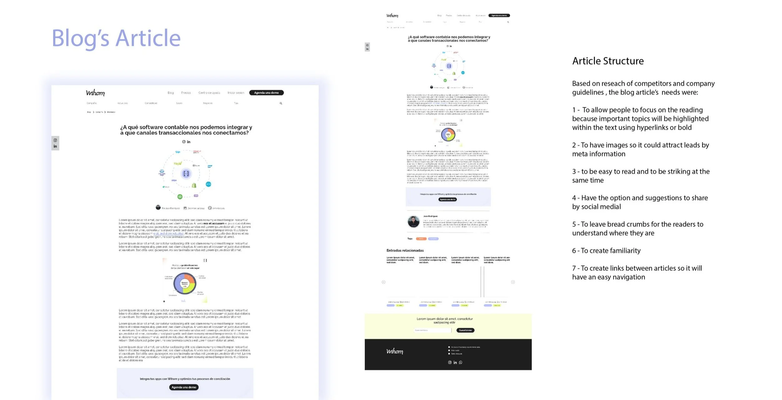
I proposed a structure based on tags, This structure proved to be advantageous for the blog as it enables users to easily comprehend the content, facilitates swift navigation, and simplifies SEO maintenance.
The design prioritizes an effortless and
relaxed reading experience.
Recognizing that individuals perceive the world differently, I incorporated a more accessible blog structure that caters to reading impairments such as dyslexia and low vision.
Unlocking efficiency with effective communication:
A team challenge
When I received the XD file, it became apparent that the prototype lacked organization, and the absence of a developed design system within the company made every minor change a time-consuming endeavor, ultimately slowing down the process.
Frequent weekly reviews and revisions led me to believe that we could improve. Consequently, I scheduled a meeting with my direct boss to address this issue and find a solution.
Ultimately, I converted the high-fidelity mockup into variables, allowing us to efficiently modify multiple sections across various screens simultaneously. This not only reduced a significant amount of extra work but also enabled us to make last-minute fixes during constant seed funding sessions where the prototype was being utilized.
Outcome
30% Increase in website visibility.
20% increase in user engagement.
20% increase in conversions.
Want to see more?

TAKEWAYS
-
As a team, we each bring unique abilities and perspectives to the table, contributing to our collective work. Without my conversation with the team leader, the app redesign would have diverged greatly from our vision, especially considering he was the sole designer burdened with a heavy workload. By taking initiative in this way, I demonstrated leadership and facilitated the process.
-
You will need to take on various roles. In my case, I was involved in the UX department, graphics design, and marketing. I had to strategize content and, in turn, saw growth in my skills and knowledge. The fast-paced environment and limited budget enhanced my problem-solving abilities. Despite constant stress and iterations, we had a lot of fun in the process.
Thank you!
While this story has concluded, there's more to discover. Connect with me on this site or through my socials to explore how I'm making an impact on the world.