

Case Study: Konvex, formerly known as Wihom
Final design of wihom’s web application
Results
30% Increased in website visibility
20% increase in user engagement
20% increase in conversions
My role
UX Researcher and Designer Intern
Team: Head of Product, Head of Development, UI/UX Lead and I
New Market Challenge
In Colombia, there's limited awareness about an app capable of managing store payments and monitoring bank statements, primarily because the country is in the early stages of adopting and regulating this technology.
By examining the funnel, we pinpointed their primary pain points, optimizing the onboarding flow to reduce steps and boost completion rates significantly.
Part of Wihom’s onboarding
What is open banking?
Open banking enables secure access for third-party apps to your banking details, enhancing financial services and creating innovative tools while providing greater control over your data. Its primary aim is to enhance financial services by granting easier access to banking data for third-party providers, fostering innovation, boosting competition, and offering consumers more control over their financial information.
Given that a substantial portion of our user base comprises small and medium-sized companies, I aimed to engage our community actively.
One of the user personas I created following interviews and desk research findings
Ensuring seamless communication between our products and web content across social media platforms was crucial. To achieve this, I devised an information architecture and managed these elements, resulting in an overall higher retention rate. This approach significantly supported our strategy for organic growth.
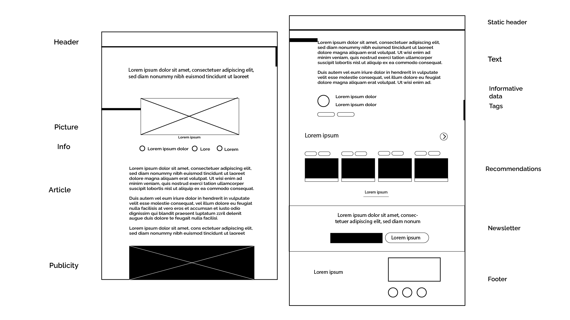
Information Architecture for the website
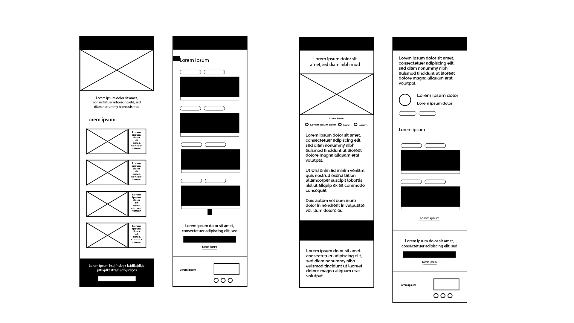
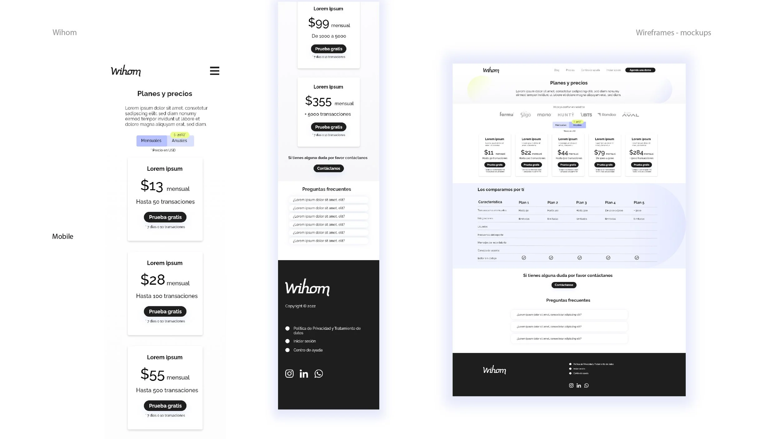
Design Process
Both the website and the app underwent several iterations through continuous revisions. I introduced a design system that enabled the team to iterate more swiftly using the high-fidelity prototype on Adobe XD, saving time and simplifying these alterations.
I demonstrated and taught my seniors how to use it, making their workload a bit lighter and more manageable. Weekly, we iterated through hundreds of screens using the high-fidelity mockup to secure funding for the company.
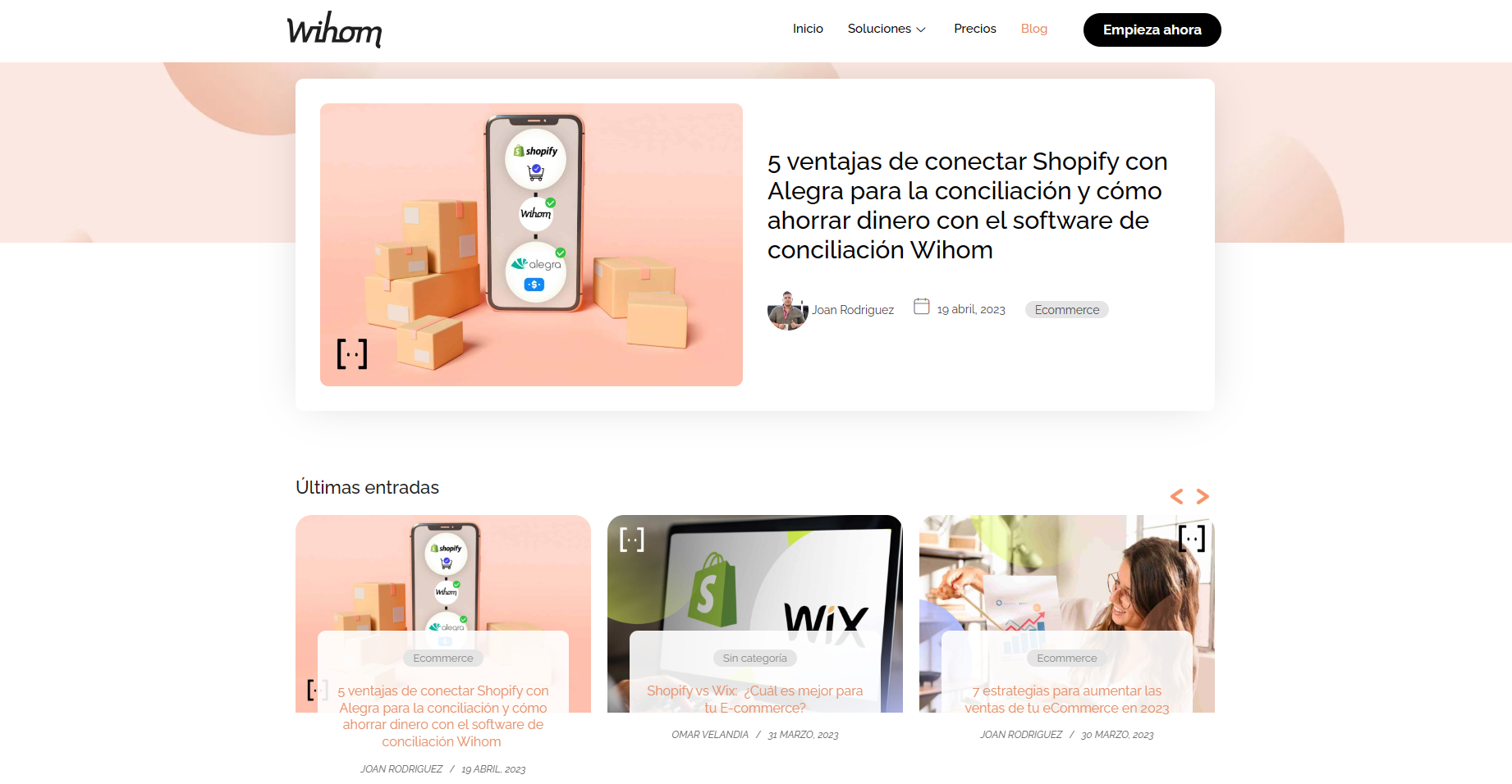
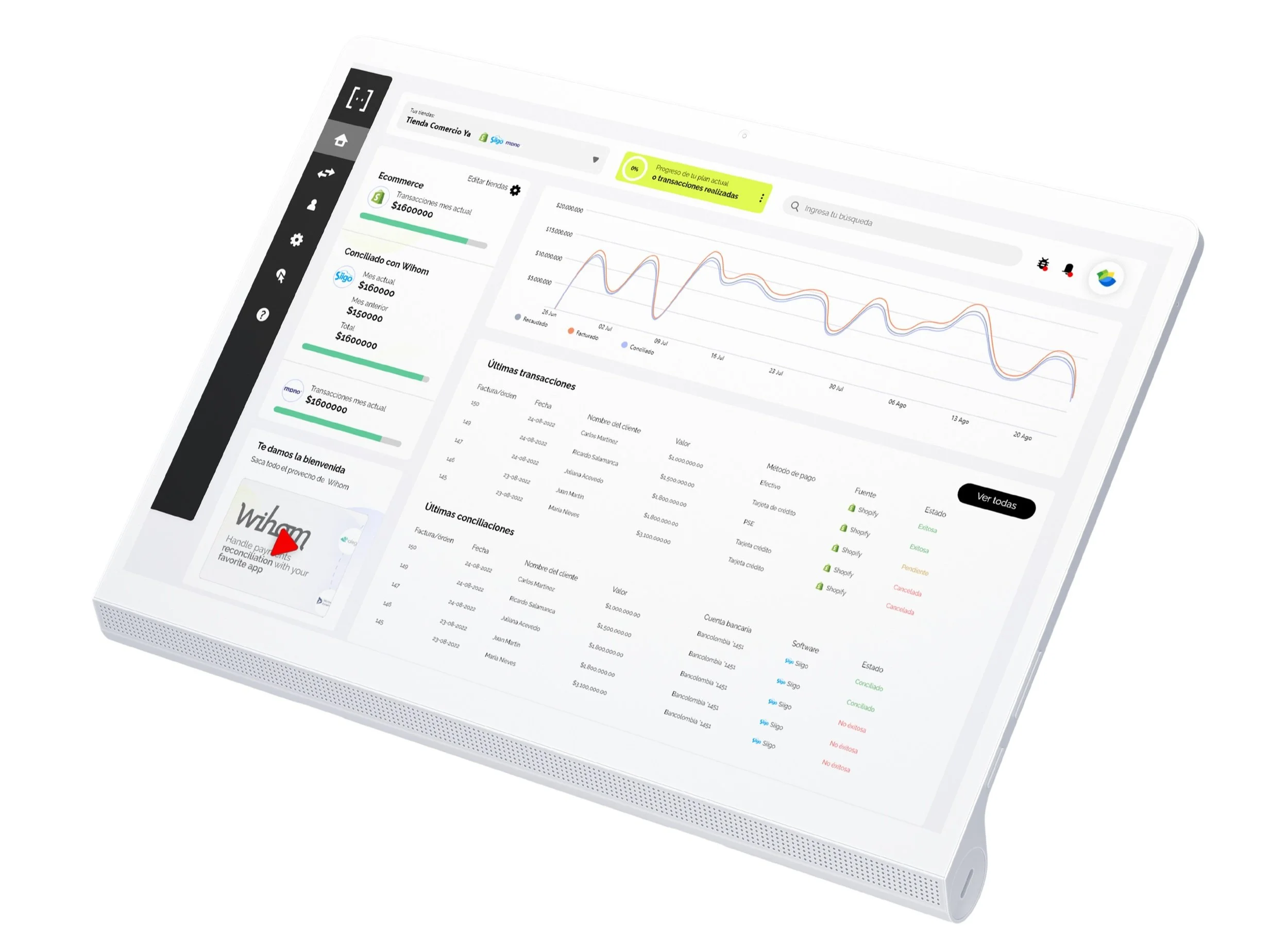
Home screen of Final design of wihom’s web application
Content Strategy
The content strategy centered on providing updated, high-quality information about open banking processes and regulations, addressing their needs with practical solutions and showcasing our services.
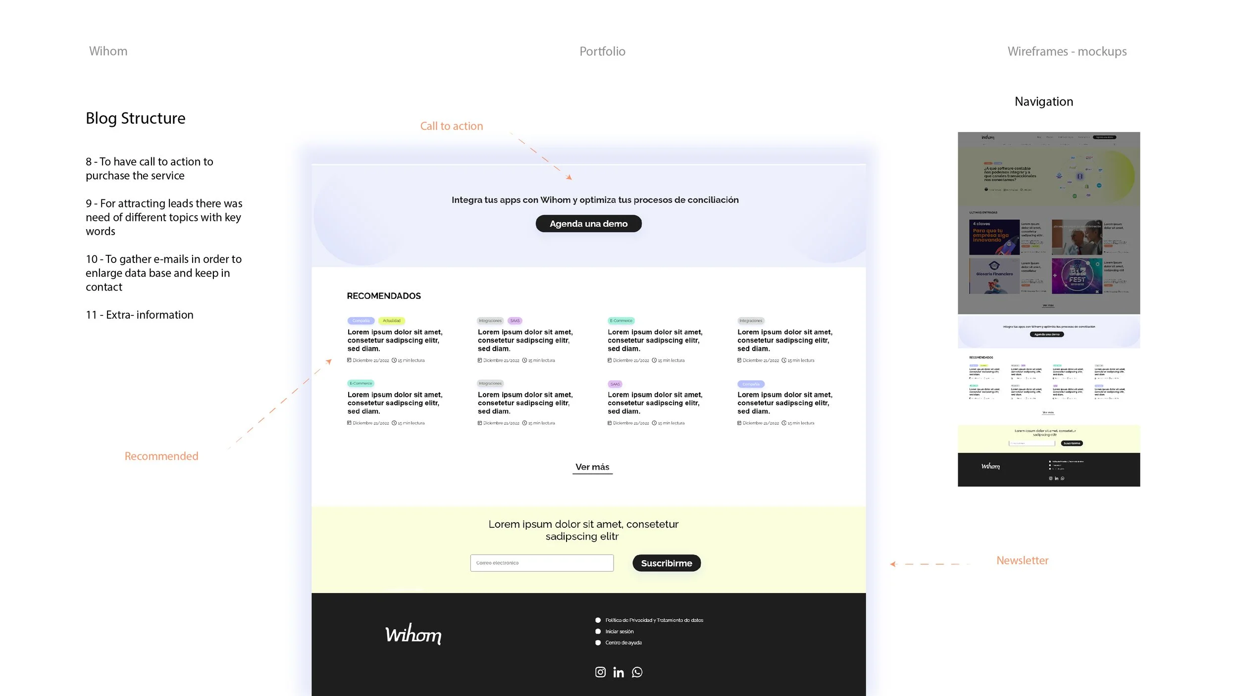
The blog became our primary focus, emphasizing a design that was clear, easily understandable, and user-friendly, playing a pivotal role in our growth.
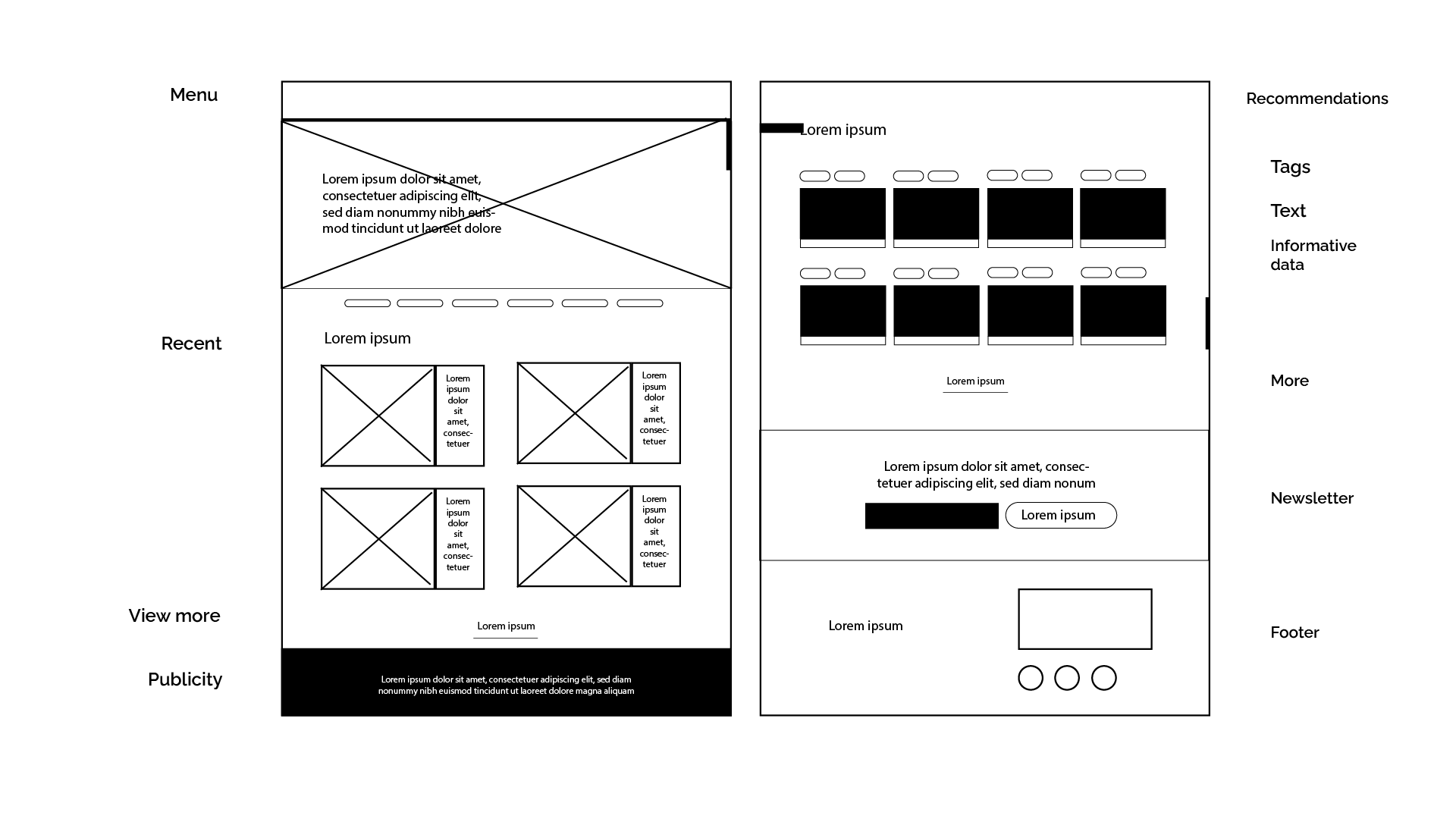
An internal structure based on tags.
This structure proved to be advantageous for the blog as it enables users to easily comprehend the content, facilitates swift navigation, and simplifies SEO maintenance.
The design prioritizes an effortless and
relaxed reading experience.
Recognizing that individuals perceive the world differently, I incorporated a more accessible blog structure that caters to reading impairments such as dyslexia and low vision.
Collecting Real Data
I utilized applications such as HubSpot, SEMrush, Google Analytics, Microsoft Clarity, Google Trends, WhatsApp, and developed user interviews to gather, analyze, and suggest various solutions aimed at enhancing our users' experience and simplifying the funnel process to gain conversions.
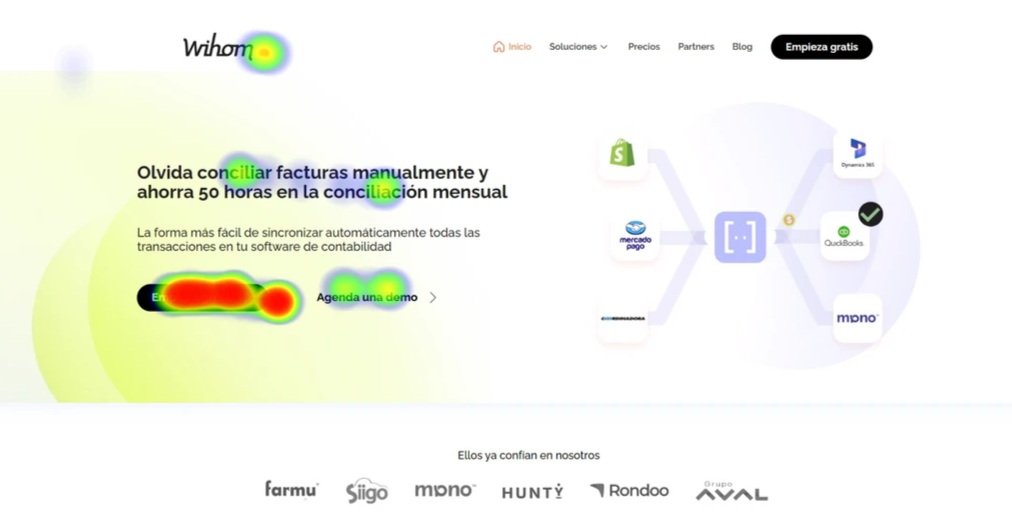
This is a mockup that simulates heat maps used to analyze user behaviors
Next Steps
We implemented a strategy of rapid iteration, learning from our errors, and actively involving ourselves with user feedback to consistently enhance our approach. Each week, we aimed to revamp different facets, adapting our perspectives accordingly.
Additionally, we established a newsletter to maintain direct communication with our users and successfully launched Wihom's web application on the Shopify store.
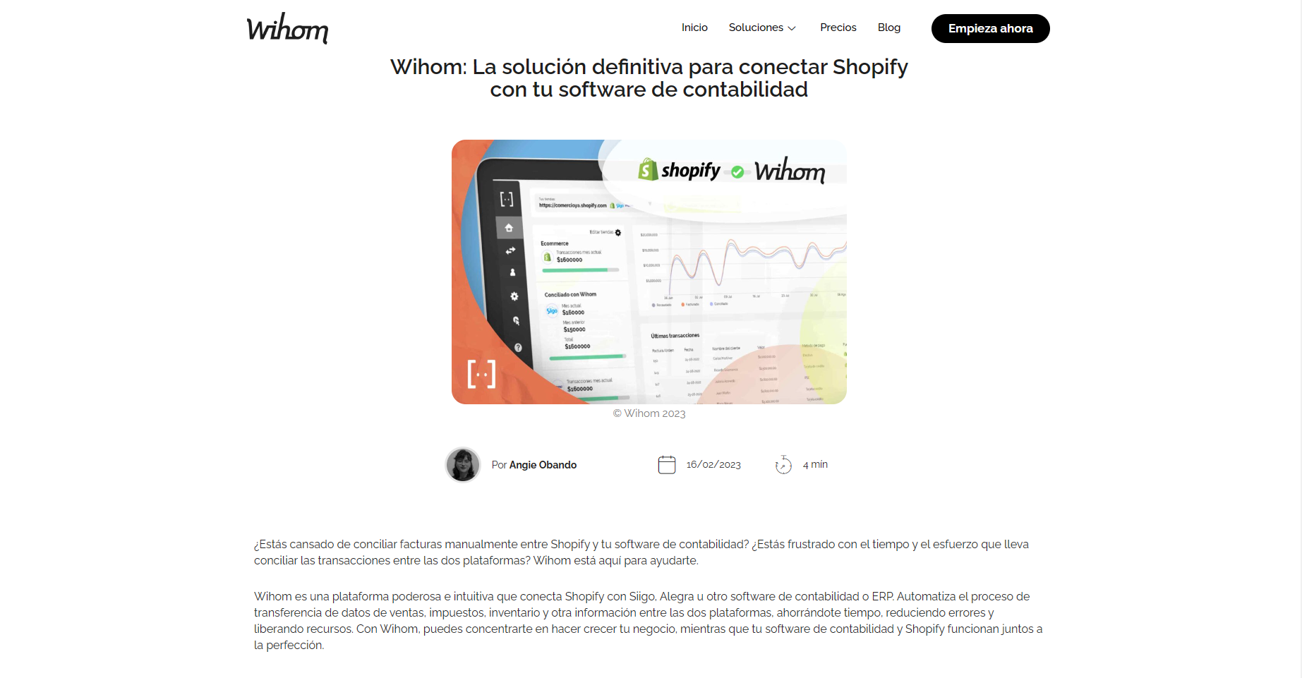
Wihom's web application on the Shopify store
Thank you for reviewing my project. If you have any questions or feedback, please don't hesitate to email me.