

Case Study: Arlington’s Public Library Mobile App Redesign
Results
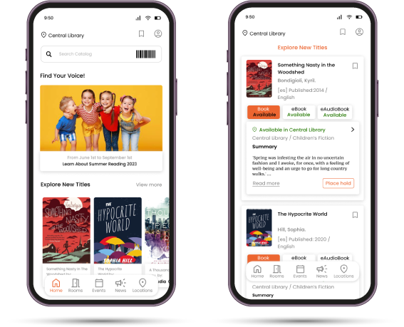
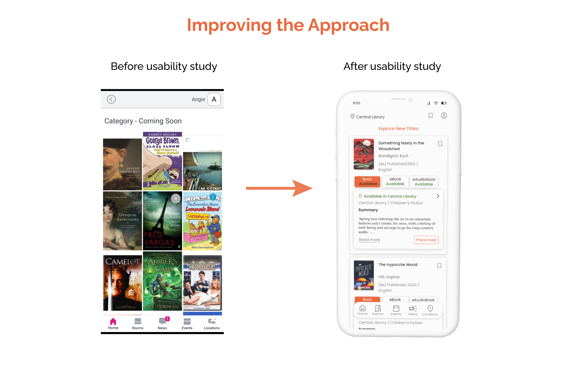
Enhancements in the overall user interface (UI)
Evaluation based on usability principles (Heuristics evaluation)
Streamlined user pathways
Enhancements in usability and accessibility
My role
UX Lead, UX Researcher, Designer
Problems
The current mobile app of the Arlington Public Library poses several challenges for users and fails to meet the requirements for a multicultural and multilingual environment.
Goals
To determine the level of satisfaction on similar apps
To determine if the app will incentive users to use the public library resources.
To determine how accessible is the app
User Reseach: Pain Points
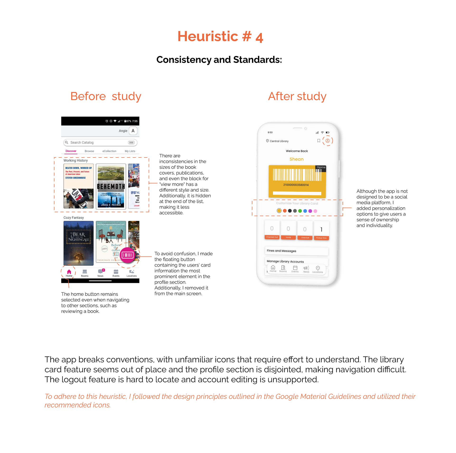
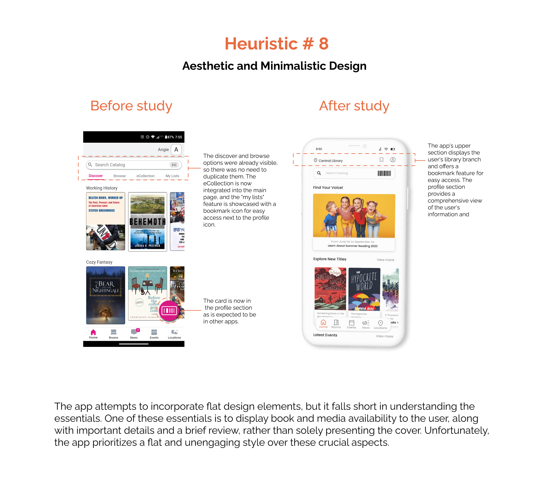
Aesthetics: Public library platforms lack modern design elements and consistency within the app (Heuristics 4 and 8).
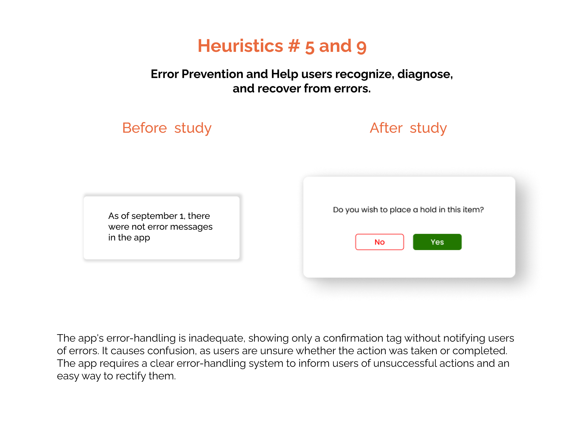
Accessibility: The public library mobile platform lacks language options and doesn't consider error prevention (Heuristics 5 and 9).
Efficiency: The mobile platform requires too many steps to check material availability.
Lost Information: The system doesn't retain the information people have previously accessed.
User Personas: journeys


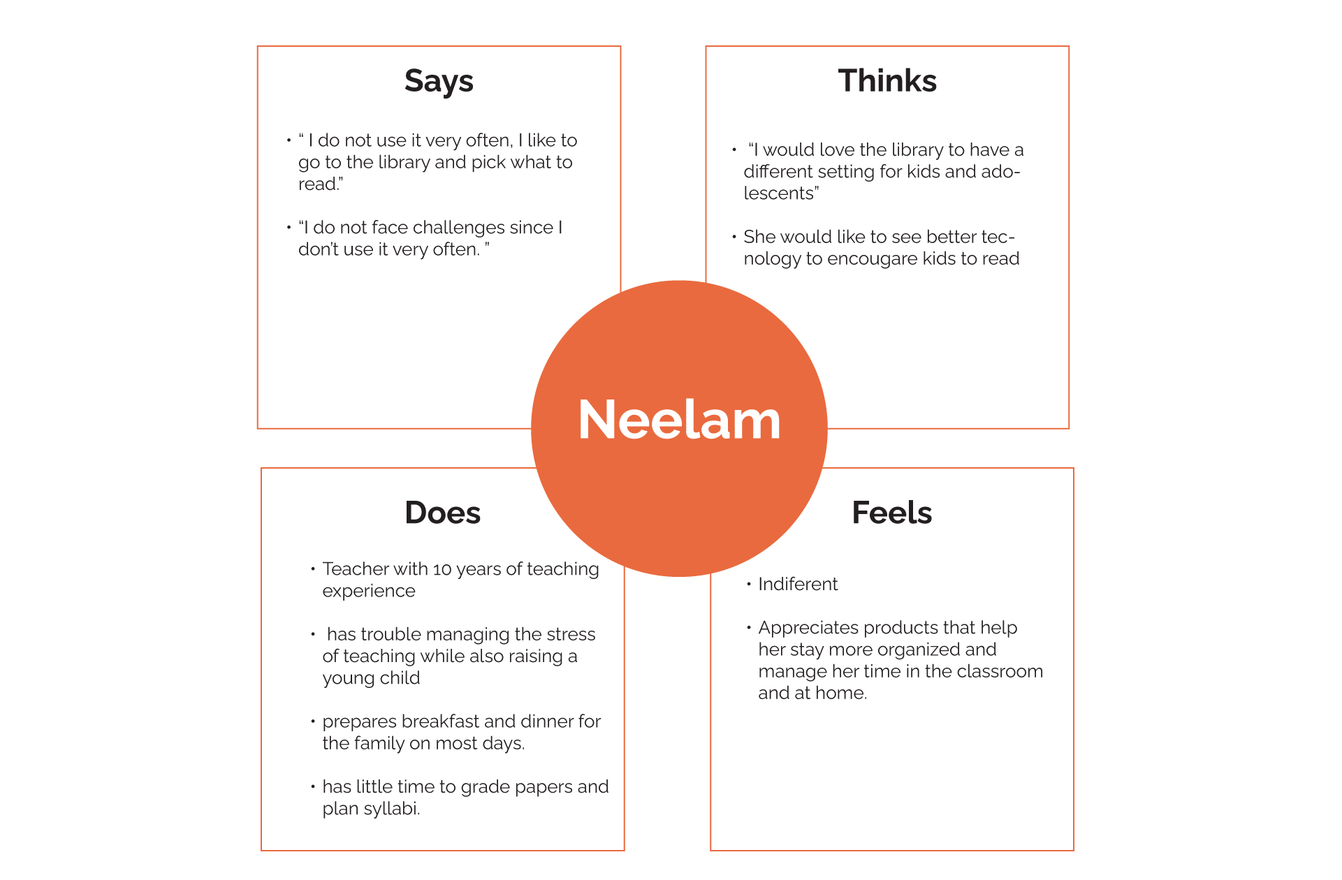
Neelam, a working mom and professional, needs a reliable backup for her researched books. Her busy life often leads to forgetting valuable materials, making retrieval impossible due to the lack of traceability. She also requires a better way to check material availability.
Examining Neelam's journey emphasizes the need for a dedicated platform to access past research materials. It also flags concerns about accessibility, especially parts with only images lacking text or captions to describe resources.
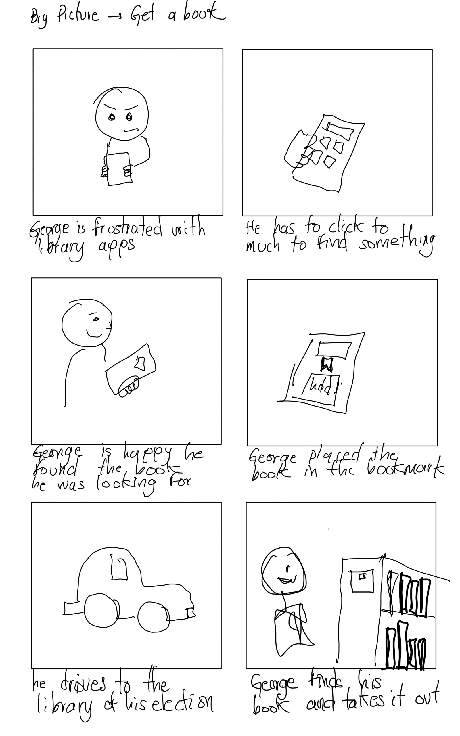
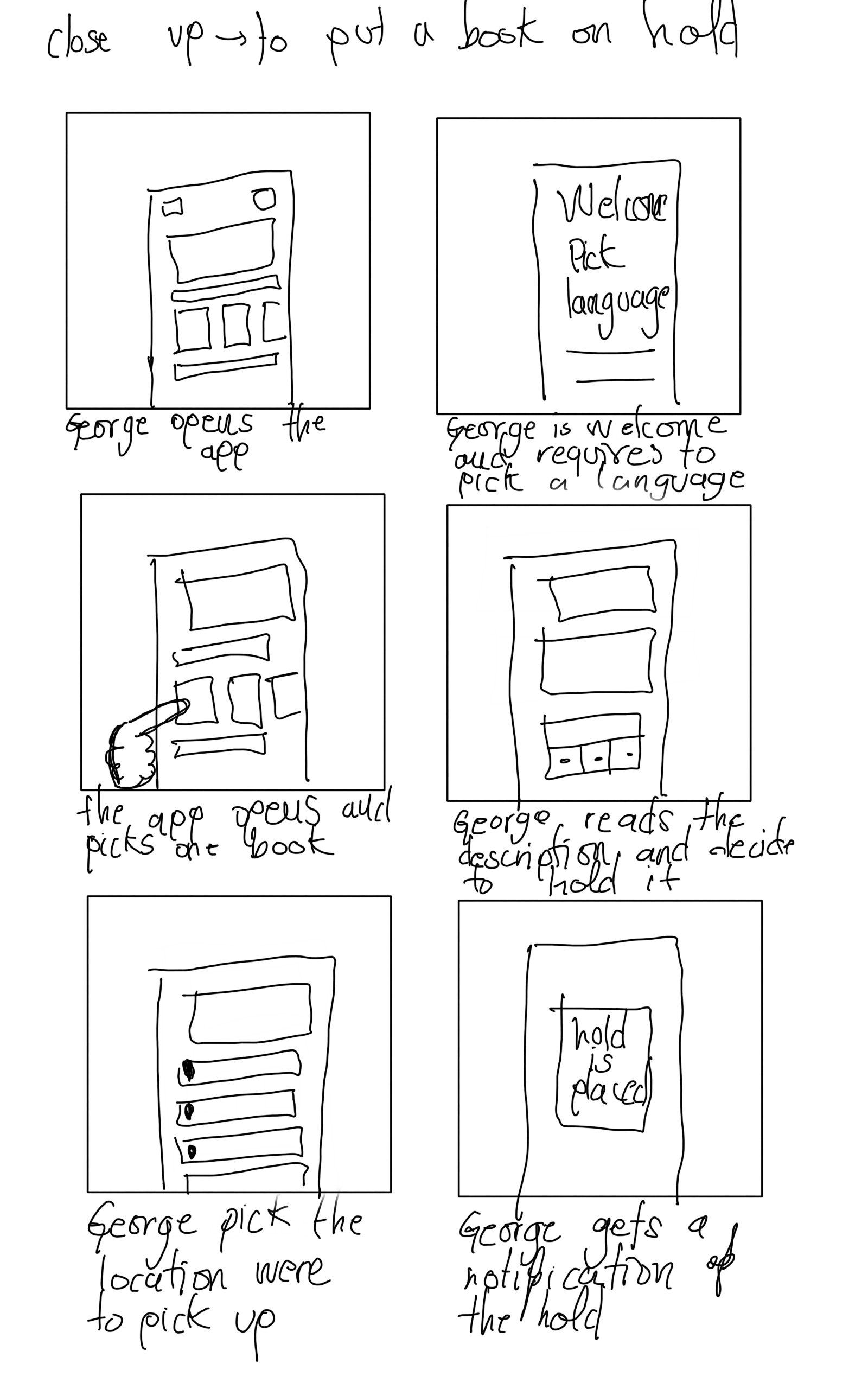
User Flows
I individually examined each action, focusing on the number of clicks needed for users to complete tasks and the potential pathways they might take. This involved progressing from basic sketches to tailored designs for each specific user action.

Heuristics
I performed a heuristics evaluation, following the renowned Nielsen Norman Group methodology, to comprehensively assess the challenges that users face when using the current application. The objective was to gain insights into areas that can be enhanced in future iterations of the app, ensuring that these 10 principles are effectively implemented for a seamless user experience.
Usability study: Findings
I conducted usability studies in the app's frequently neglected sections, including the language, profile, and checkout areas. During the initial round, I identified the need for additional features to enhance user experience. In the second round, I performed A/B tests to refine and improve these interactions.
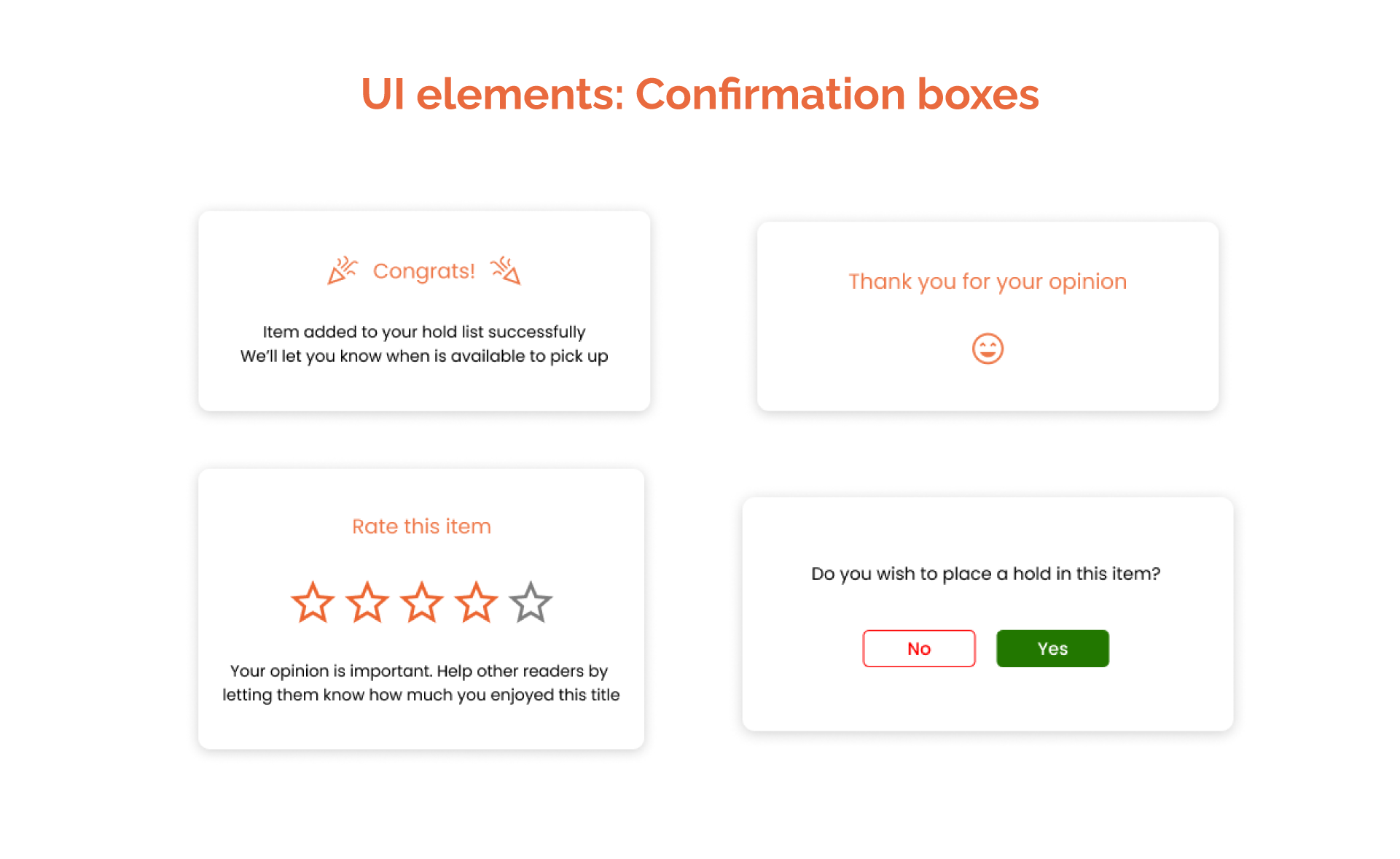
Accessibility Considerations
Fonts: To enhance accessibility for a wider audience, I integrated a serif font for improved readability, especially in larger text. Additionally, I included larger font sizes, beginning from 14 points.
Enhancing UX Writing: Offering clear explanations of actions taken or about to be taken helps individuals of all ages feel confident in their decisions, both before and after committing to them.
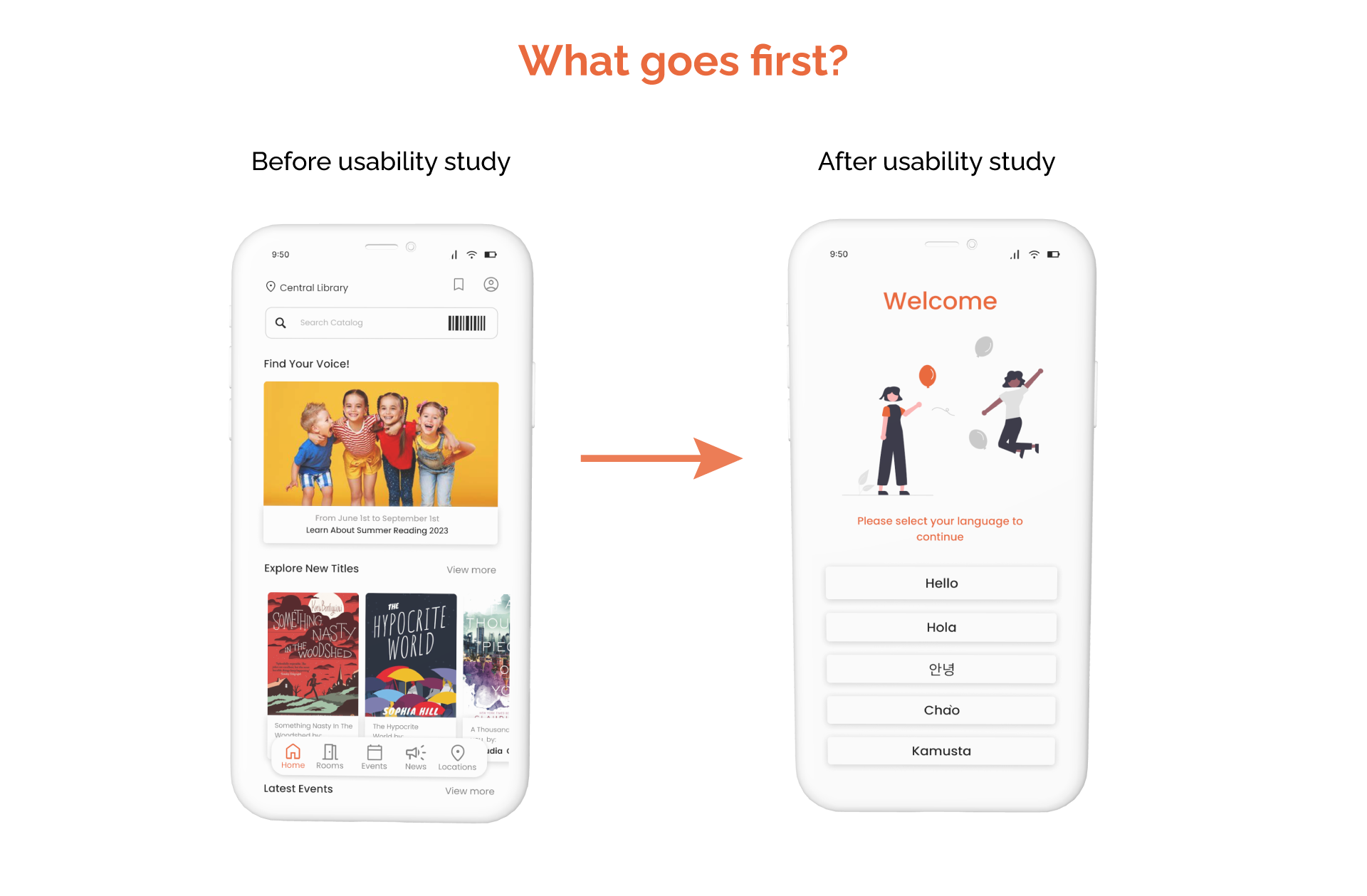
Language Inclusion: By including additional languages, I acknowledge the diverse population served by this public library, aiming to bridge any potential gaps.
Design
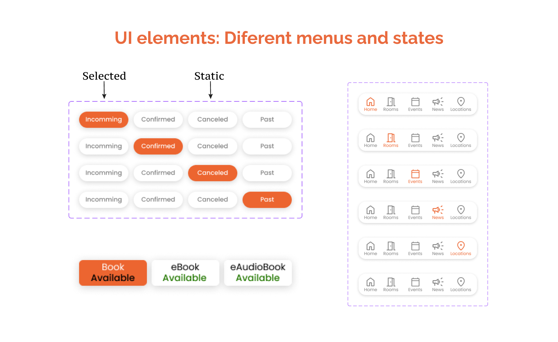
I emphasized a more inclusive color palette, improved UI elements like confirmation messages, and developed distinct states for various actions.

Takeaways
Impact: The aim of this case study was to emphasize the significance of public system services and accessibility. It showcased potential enhancements through the analysis of real data and the study of actual scenarios.
What I learned: Drawing from real data, it's evident that approximately 15 percent of Arlington County residents speak Spanish, and there's a notable presence of unaccounted-for Asian languages. Implementing additional measures becomes crucial to ensure equal access for all residents, as the public library provides valuable resources that might otherwise be challenging to access.
Next Steps
There are numerous features yet to be explored, necessitating new research and implementation. This applies not only to the app but also to the website and all screen systems within the library.
A dark mode and accessibility settings are required for future improvements.
Thank you for reviewing my project. If you have any questions or feedback, please don't hesitate to email me.