

The Fund for Peace
CONVEY BETTER TO PROMOTE PEACE
Web and mobile redesign / Non-profit
OVERVIEW
The Fund for Peace works to prevent conflict and promote stability in fragile states through research, analysis, and peacebuilding initiatives.
My role: UI/UX Designer Lead
Team: President and Executive Director, UX Researcher intern and other stakeholders
Time: 10 Months / Part time
Tools: Figma, Card sorting software, Microsoft teams.
ROADMAP
-
The Fund for Peace has not updated its website since the early 2000s, resulting in a poor and confusing user experience. Visitors often struggle to navigate the site and fail to achieve their objectives. Additionally, there is a common misunderstanding about the organization's mission—many users mistakenly believe that the Fund provides financial aid, when in fact, it seeks donations and support to continue its peacebuilding operations.
-
I began by conducting a series of interviews with FFP members to gather insights they’ve acquired over the years. This information informed the needs for the redesign. Based on these findings, I developed a new information architecture (IA), utilizing multiple card sorting techniques to ensure a user-centered structure.
-
In collaboration with the FFP chair, and with a focus on the organization’s vision, I designed a comprehensive UI style guide. This guide emphasizes renewed branding aimed at improving communication clarity and effectiveness.
Research and IA
Benchmarking and competitor analysis
To gain a better understanding of the client, I conducted a series of interviews with the chairman and collected data on their activities and motivations. I also created a comprehensive document that included a competitor analysis, exploring the communication strategies and overall aesthetics of human rights-related nonprofit organizations. This groundwork provided us with a solid foundation moving forward.
Information Architecture redesign
Navigating the Fund for Peace website is a challenge for both users within and outside the organization. The fund provides a wealth of valuable resources for investigators and researchers, and it's utilized in public services and government contexts. I needed to ensure that this information was easy to find and readily accessible.
Some of the noted problems included broken links, links that redirect users away from the website without any warning, difficulty in navigating back, outdated information about contributors, and overall poor data management.
By collaborating closely with the Chairman, we successfully developed an information architecture that was easy to navigate and more closely aligned with FFP's mission.
Fire trial, closed card sorting.
We held two card sorting sessions: the first to train the intern and collect preliminary data, and the second to validate the results and enhance the study. At the end of our session presenting the findings, we conducted an open card sorting exercise with the team.
What we learned:
Our initial information architecture (IA) was largely effective from the start, as we employed heuristics to make informed decisions. However, we needed to rename two categories, which required us to clarify our communication goals. We gathered input from a panel of active FFP members who voted on and suggested names based on their familiarity with the foundation.
Defining new UI
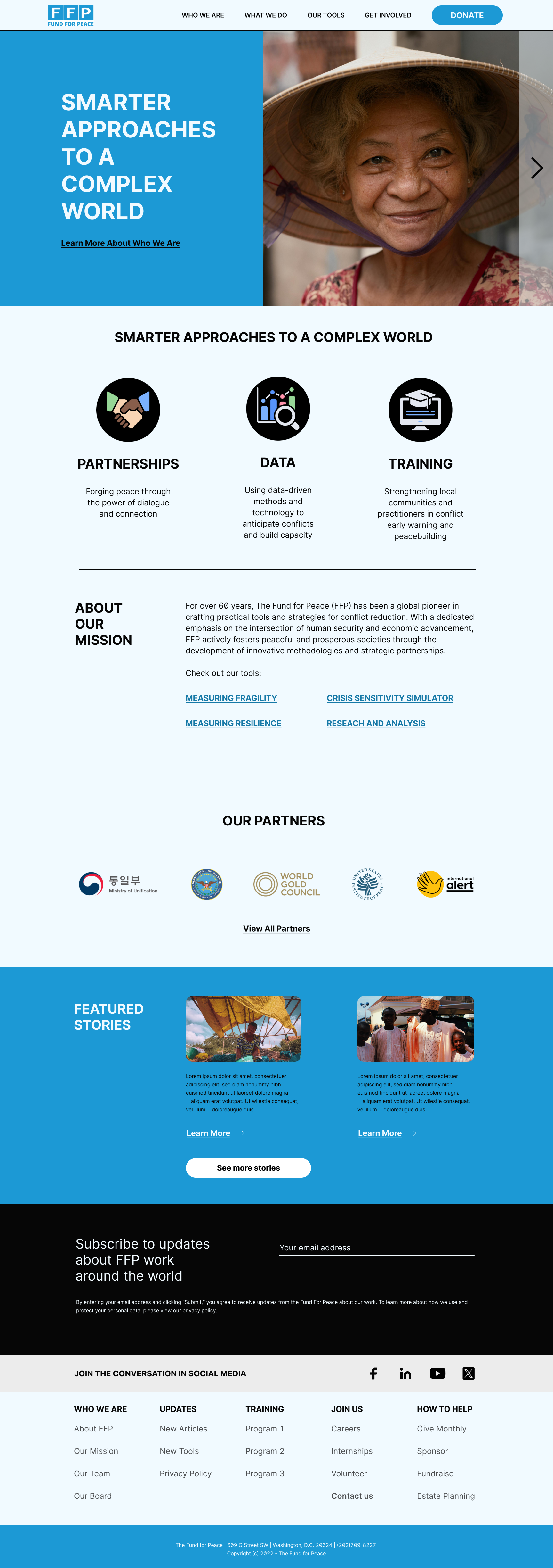
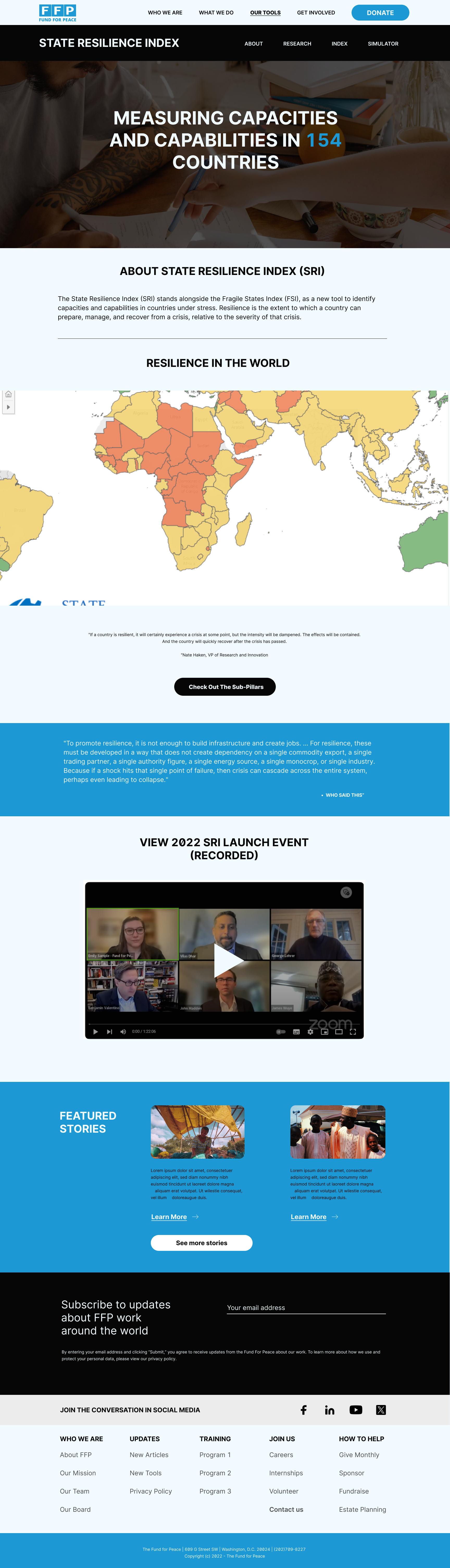
The Fund for Peace aimed to evoke a fresh atmosphere while utilizing its classic blue and white corporate colors.

Old website
New design optimized for web and mobile
Colors
The palette incorporated new shades to create a softer experience, as pure white and pure black can be harsh on the eyes. Additionally, it is compliant with WCAG standards.


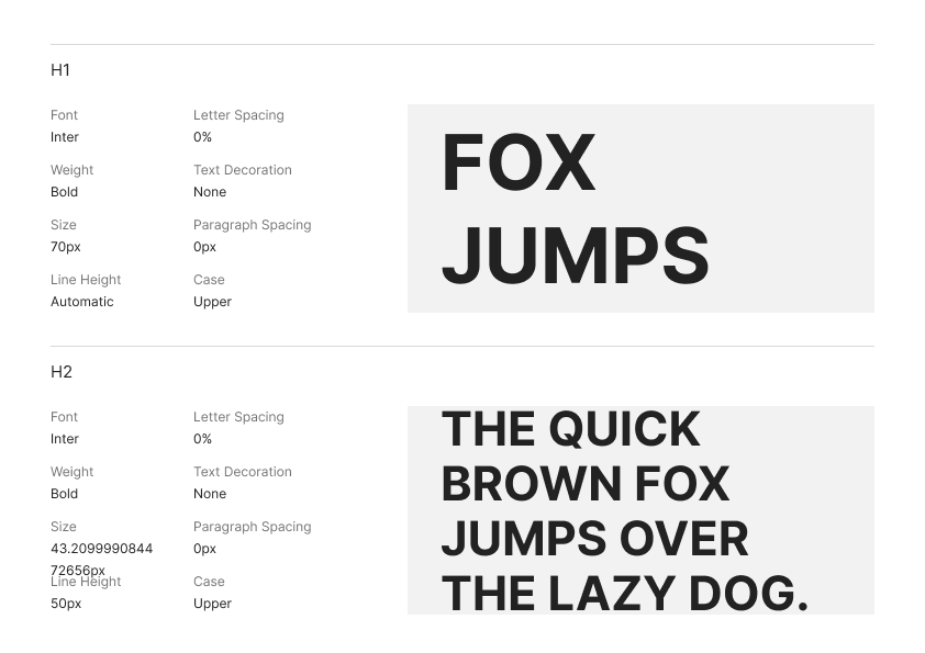
Font
For brand considerations and given that the Fund for Peace is seeking a long-lasting solution, I opted for an easy-to-read font, specifically Inter.
Big Challenges
Smart navigation:
FFP's main goal is to efficiently distribute the vast data they collect and make a meaningful impact. Ensuring easy access to their articles was a top priority. However, challenges arose from how they process information and the limitations of free WordPress plugins. To solve this, I designed a dual navigation system that allows for quick scanning and is now available for FFP's use. I also implemented this navigation approach in other text-heavy sections, such as browsing board member information, to further streamline user experience.
Create a unified experience across all brand products:
FFP's new initiatives feature different branding and navigation, with some hosted outside the main URL. To simplify adding new projects, they created separate websites and linked them to the main site. However, this approach caused confusion, as the inconsistent designs led users to think the State Resilience Index and Fragile States Index were from different organizations. The solution was to redesign the homepage alongside the State Resilience Index homepage, creating a unified look across both.
Getting in touch with the organization is nearly impossible.
In line with the overall section design, I developed an A/B test to evaluate its efficiency, comparing the results with their preferred approach for managing incoming requests.
The FFP chairman decided to launch the A option first, as implementing option B would require an internal restructuring they were already considering but lacked the necessary infrastructure to support.


B
A
Mobile considerations
The current website is not optimized for mobile, making navigation and interaction a frustrating experience. That's why I focused heavily on mobile aspects, such as menus, overall design, and usability.
TAKEAWAYS AND NEXT STEPS
-
The website is currently in development, with a planned release by 2025. Due to limited resources, progress has been slow. Still, the team is optimistic about launching it soon to begin gathering real data in addition to the in-house usability tests conducted.
There are numerous ways to enhance the website, but we will need more user testing to ensure accuracy. -
Not only for the organization but as the design lead, I experienced personal growth within the constraints and had the opportunity to train the UX research intern, witnessing significant improvements in her overall skills and career trajectory.
Thank you!
While this story has concluded, there's more to discover. Connect with me on this site or through my socials to explore how I'm making an impact on the world.